7-24-21
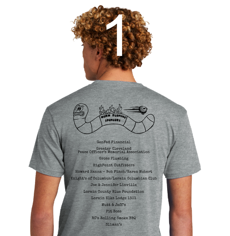
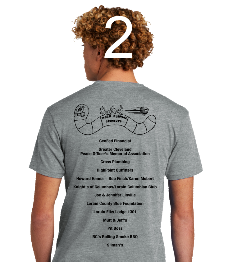
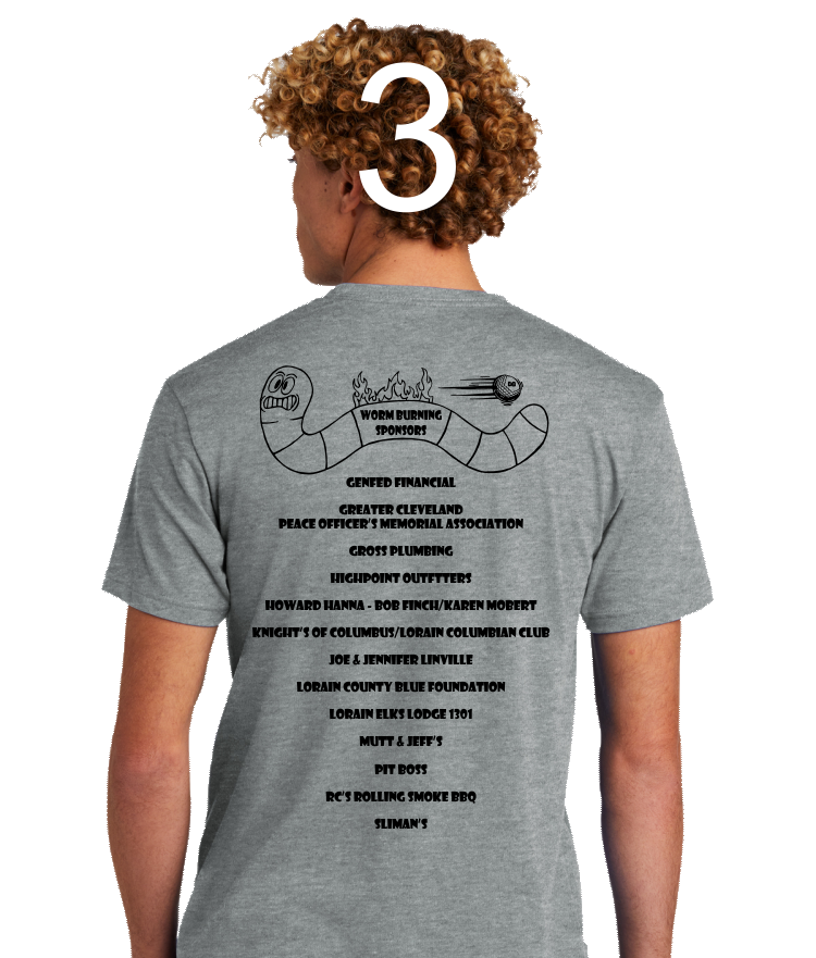
Okay here we go with the rest of the back. I think I've got them all listed here. Couple of things to note:
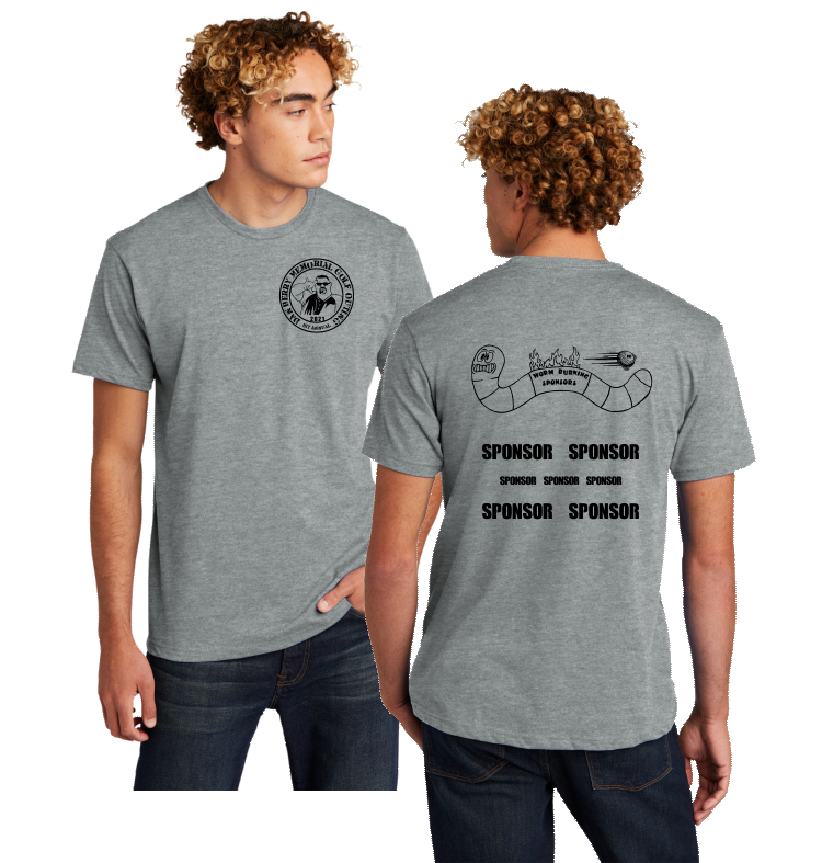
- We can scrunch them closer together, if you like. I thought if we spread them out a bit, they'd get noticed.
- I plugged in three different fonts. You may like all or none. You'll let me know.
- I straightened out the WORM BURNER text on one of the choices (I think you asked for this?) Let me know if you it that way.
- When do you need 'em? Are we 100% sure we're done with sponsor list? If so, we can print Monday. If not, we can print the front and wait a bit on the back.
- Regarding hats: I have to ask Scott to digitize the logo for embroider. What kinda hat for Randy?
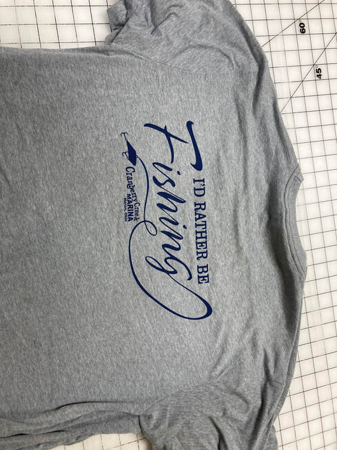
Navy ink on grey tee:
WORM BURNER TEE: update 7-6-21
Here's the overall back and front, showing just the two graphics that you provided. We vectorized them for use here. I have no idea how big you want that worm...maybe smaller and tucked up against the top? That's a cool look. Maybe in the middle surrounded by sponsors? We can play around with that. I'm also showing the chest design a little on the big side here...but it can be whatever we decide in terms of size.
The shirts are here (I ordered them in May) so we're in good shape on that measure. I ordered 100 shirts in the sizes we discussed.
Once we have the art solidly determined, we can make the screens, which will expedite.
As far as waiting on sponsors, it's always the sooner the better. So as you get them, please send the info so we can at to the design. At the end of the day, as they say, since everything else will be at the ready, we could technically wait until the wee very last minute to print (like a couple of days before) but this always makes me nervous because anything can go wrong (usually doesn't but it's when you NEED it work that stuff happens).
Let's just keep it rolling and see where we get. No need to panic. We have done jobs the day before the event before, when there was a failure to plan on the part of the event planner. It's not optimal, but it's part of the beauty of working with us :-)
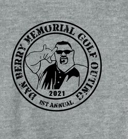
- Here's a closeup of the left chest. Tried to create a little design out of the graphic. Picked a rugged font...made "1st annual" a little smaller just to add to the dynamic. If you want to pick a font that you like better, go to 1001freefonts.com and see what you like. There are a few basics to consider when selecting a font that will be displayed on an arc (if we choose to keep the circle).
- No script (those become illegible when you bend them).
- All upper case works better too.
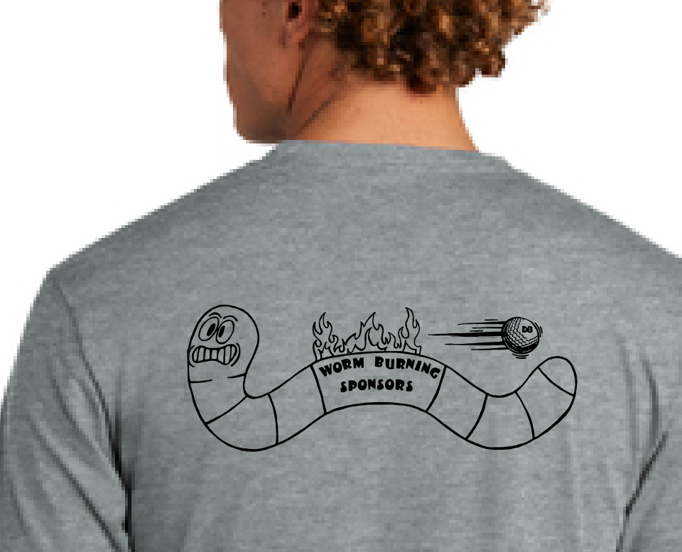
Here's a closeup of the back. As it relates to infusing some color...I have a few general thoughts that always prevail. First...black on grey is really masculine and looks cool (in my opinion). Athletic, rugged. Second, color adds cost. Third, adding spot color to this graphic would look a little home grown, in my opinion (like a coloring book, sort of) unless you developed the flames as a gradient, which would add even more cost (that's a complex print). I tried to add a little pop of color here and there (to the ball, etc) not sure how I felt about what I was seeing.
Scott is busy on the press today but manipulating the art is more his bag than mine (I have no skill in that arena), so I have it on his desk to help with this.
Scott is busy on the press today but manipulating the art is more his bag than mine (I have no skill in that arena), so I have it on his desk to help with this.
STOP
GOLF OUTING TEE-SHIRTS
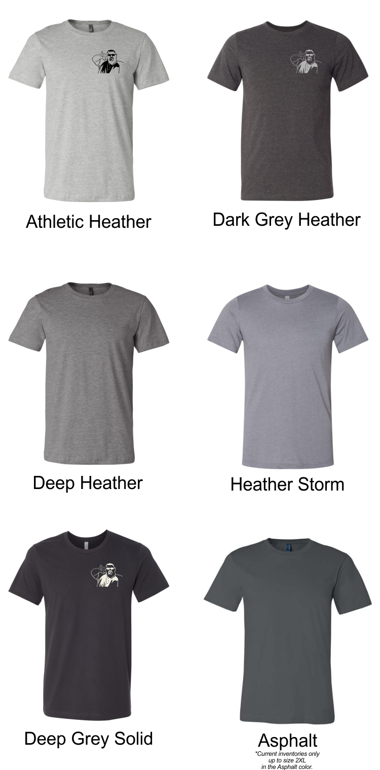
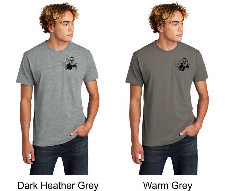
Two brands of tees shown below, along with whatever shades of grey are currently available. Also shown are ink colors (sort of). Black ink looks best on the lighter shades of grey. We also have light grey ink that looks nice on darker greys, it's not as bright as white. We also have an off-white that looks really nice on darker greys. Hard to show on screen, but I tried. I have some shirts in my own closet printed with this color that I can show you. My personal fave is the black logo on the dark heather grey at the bottom. Classic.
Let me know your preference and I can get the shirts in asap.
Let me know your preference and I can get the shirts in asap.
BC3001
- 4.2 oz.(US) 7 oz.(CA), 100% airlume combed and ringspun cotton, 32 singles
- Ash is 99/1 airlume combed and ringspun cotton/polyester
- Retail fit
- Unisex sizing
- Coverstitched collar and sleeves
- Shoulder-to-shoulder taping
- Side seams
- Tear-away label
All are available in XS-4XL except for Asphalt, inventories right now are only available up to 2XL in that color. There is NO 3XL, but there is 4XL (if you need that, but I'm guessing not).
NL6210 Next LEvel brand tee
- 4.3 oz., 60/40 combed ringspun cotton/polyester, 32 singles
- Fabric laundered
- Set-in CVC 1x1 baby rib collar
- Side seams
- Tearaway label
